01
logoevolution.
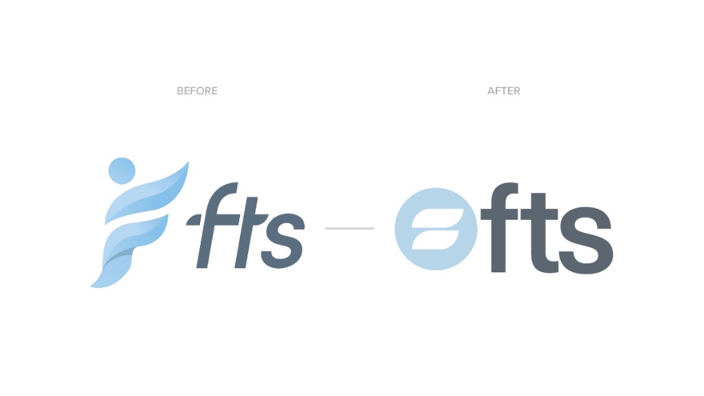
From original mark through refinement to final lockups — precision, growth, and forward movement in a system built for recognition across staffing and recruitment.

staffing company rebrand.
Full-scope rebrand for a national staffing leader — identity system, culture deck, and connected digital properties.
staffing company rebrand.
Strategy, Design, and Production
Full-scope rebrand for a national staffing leader — identity system, culture deck, and connected digital properties.
act i — the system
Logo evolution, color & type, and identity applications — one cohesive system built to scale.
From original mark through refinement to final lockups — precision, growth, and forward movement in a system built for recognition across staffing and recruitment.
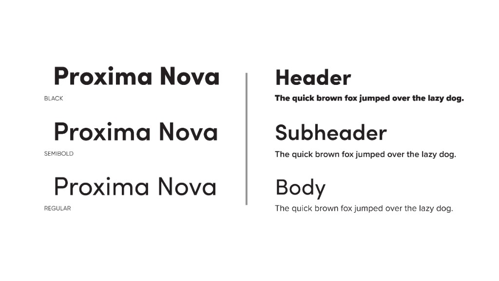
Proxima Nova across Black, Semibold, and Regular — a clean scale for headers, subheads, and body across staffing and recruitment touchpoints.

Deep navy anchors trust. Sky blues and muted grays keep the system tech-forward. Warm gold accents add energy — professional, approachable, and built for both corporate and candidate audiences.
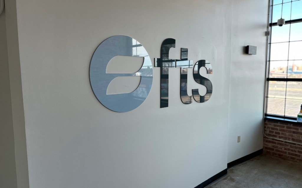
Business cards, environmental signage, presentation templates, and UI mocks — the identity in market, not just on a guidelines PDF.
the challenge
FTS needed a brand that could signal innovation to candidates and reliability to enterprise clients — without feeling like every other staffing firm in the category.
the solution
We built a modular identity anchored in deep navy, sky blues, and warm gold — a system that reads tech-forward in digital and authoritative in person.
the approach
Logo, color, type, and applications were designed as one ecosystem — then extended into editable decks and culture materials teams could actually use day to day.
FTS is a staffing and recruiting company driven by innovation and efficiency — enterprise clients and candidates judge firms on credibility from proposal to first search. ninety two delivered logo, typography, color, modular identity, brand applications, editable culture decks, and extension into the public corporate web presence at ftsco.com. Identity and applications were built as one ecosystem, then carried into live digital touchpoints; a future site rebuild is in progress and is not represented here as completed launch work.
B2B brands scaling identity across proposals, culture materials, and digital touchpoints — especially when brand and web need to read as one system.
Full-scope rebrand for a national staffing leader — identity system, culture deck, and connected digital properties.
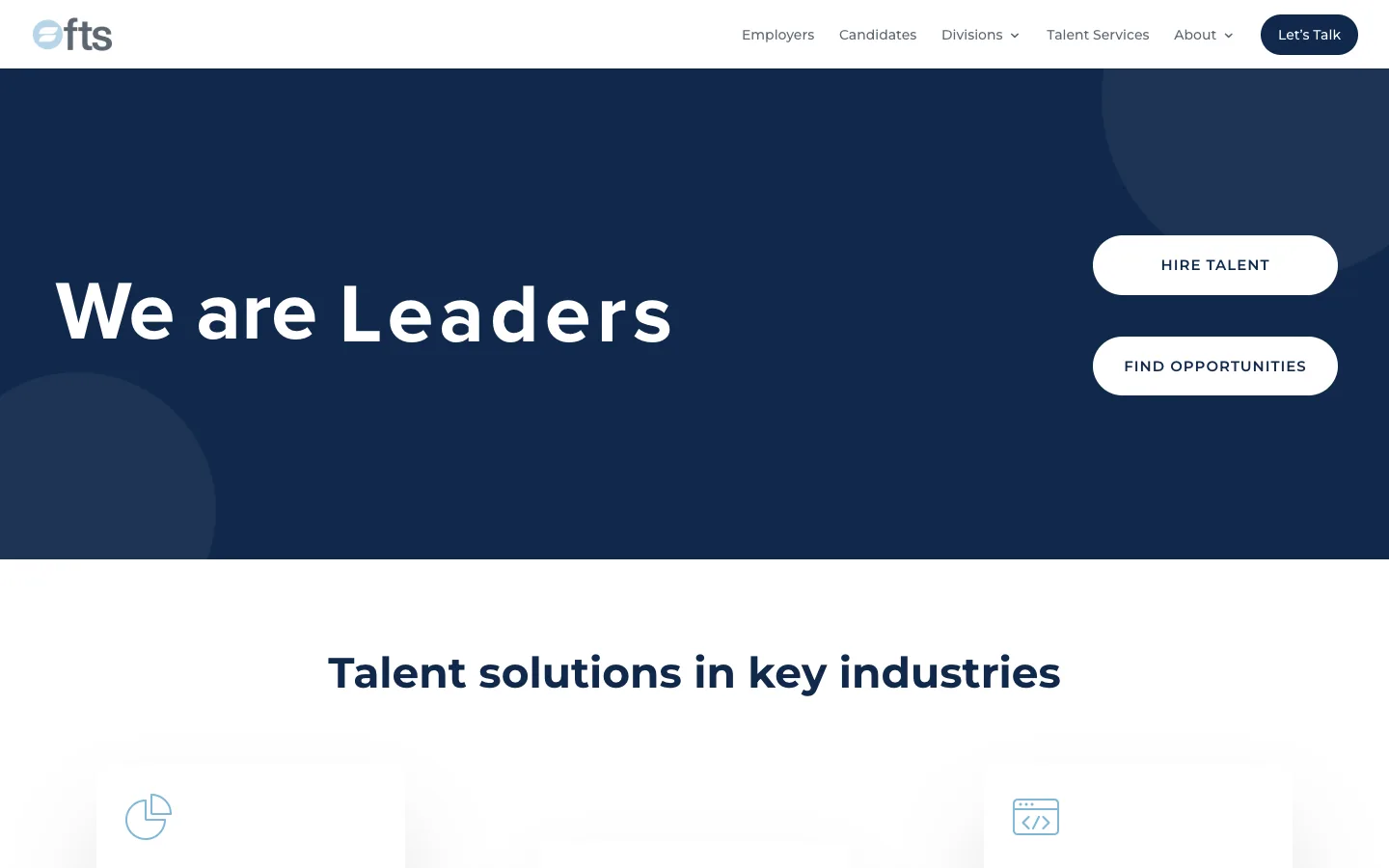
ftsco.com reflects the identity system in market today. Future rebuild scope is separate from this case study.
act ii — in practice
ninety two supports FTS with editable layouts, slide systems, and culture communications — brand guidelines turned into daily tools.
Internally, FTS needs layouts that teams can edit fast. We build decks, documents, and culture materials on-brand — professional, appealing, and easy to update.
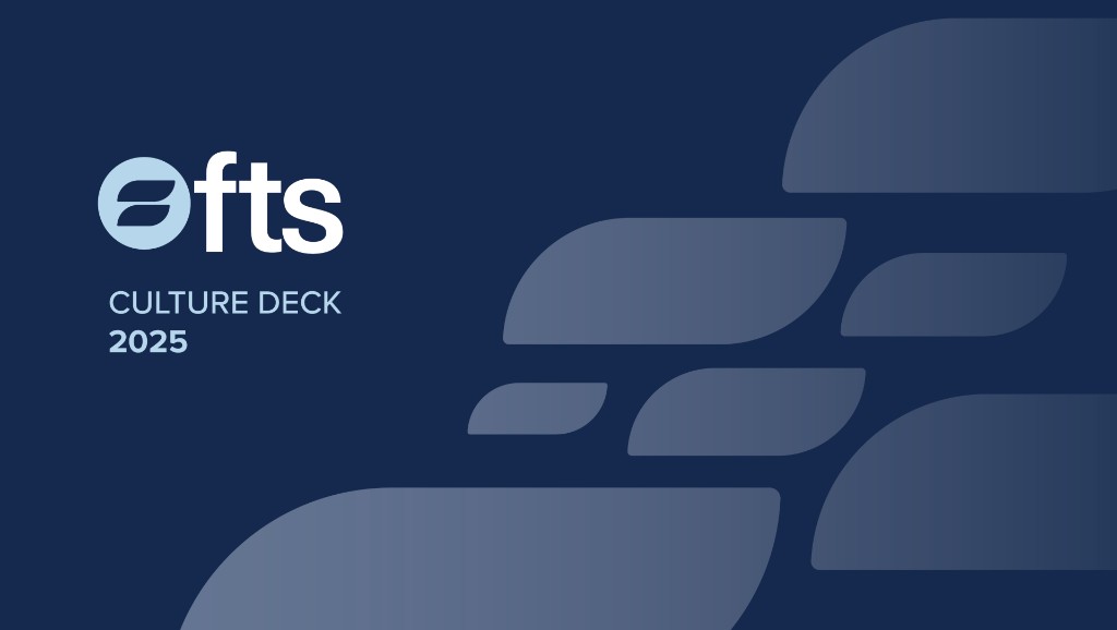
A slide system for new and existing employees — brand palette, assets, and messaging woven into a deck that reflects FTS values and voice.
ready when you are
ninety two is strategy through execution — identity, websites, campaigns, and production built to show up in the real world. Tell us what you are building next.